
The Calendar is your trading history laid out as an actual calendar. In Month view each cell is a day; in Year view each cell is a whole month. Either way, each cell is colored by how you did.
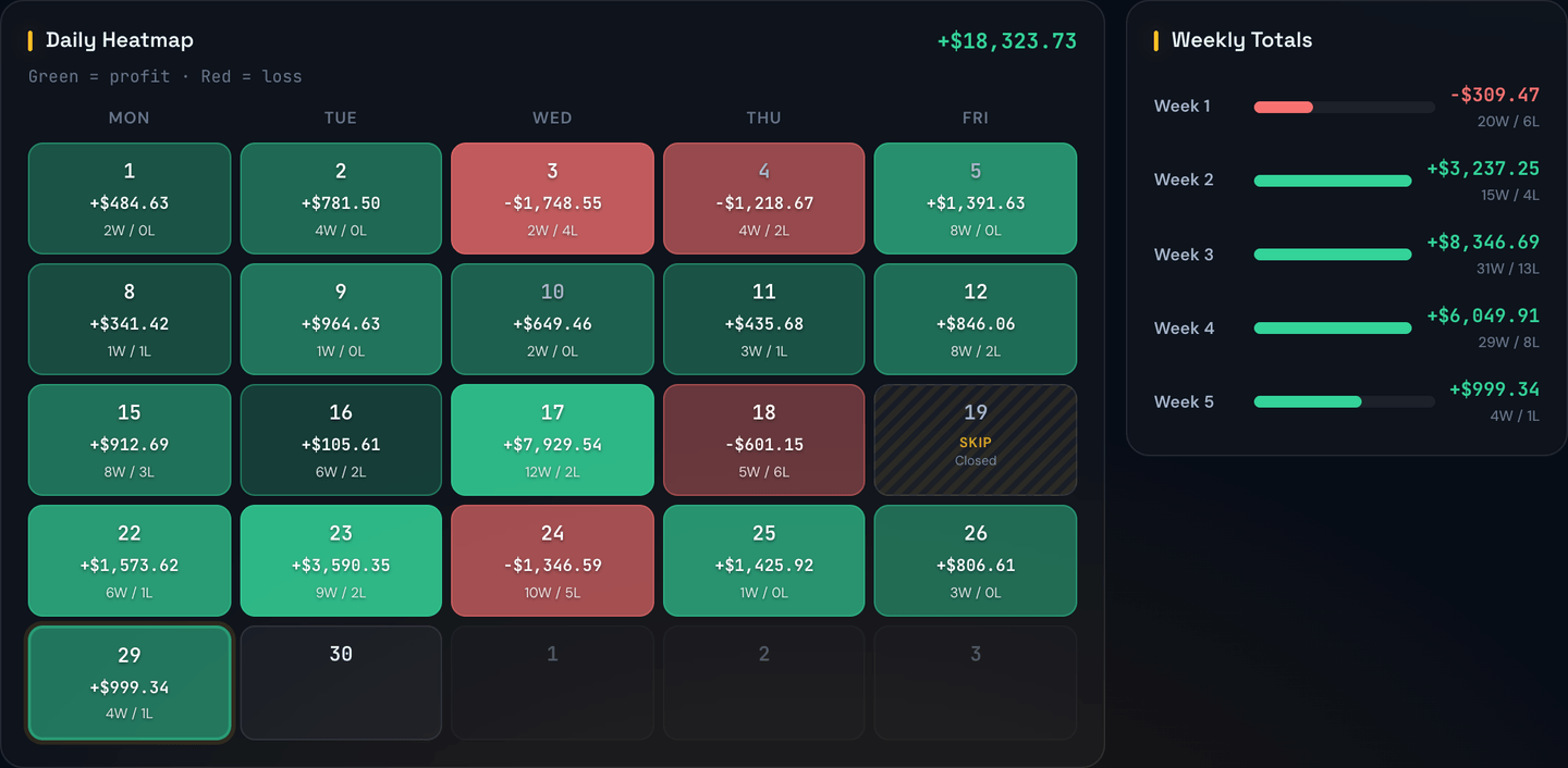
Reading the grid
- Green days are profitable.
- Red days are losing.
- Grey or empty days are days you didn't trade (or the market was closed).
- The bigger the dollar figure on the day, the more saturated the color.
At a glance, a month that's mostly green with a few small red days tells a different story than one with three giant green days and a dozen small red ones — even if the totals are the same.
Month and Year views
Use the Month / Year switch at the top right of the page to choose how much time you're looking at.
- Month shows one month, with a cell for each trading day and weekly totals down the side. The days add up to the month's total.
- Year shows all 12 months of one year, with a cell for each month and quarterly totals (Q1–Q4) down the side. The months add up to the year's total, the same way the days add up to a month.
The stats strip (Net, Wins, Losses, Win Rate), the P&L bar chart and the Win/Loss donut switch along with it, so they always cover the month or year you're looking at. In Year view, the bar chart shows one bar per month.
Month colors work like day colors: the bigger the month, the stronger the color. Your biggest month of the year gets the strongest shade, so a standout month is easy to spot.
Click any month in Year view to open that month.
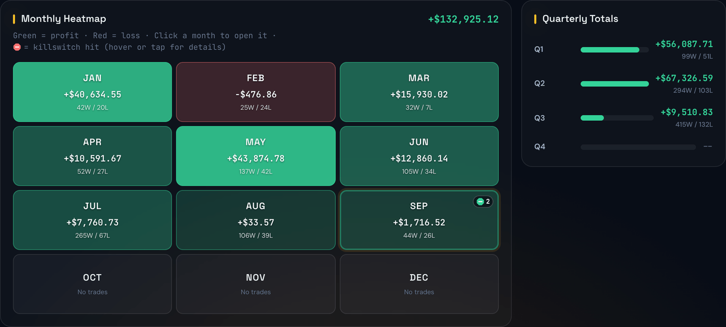
Example
It's December and you want to see how your year went. You switch to Year. Nine months are green and three are red, and the heatmap header shows +$8,450.00 for 2026. Q3 is your only red quarter at -$1,120.00, and August is its darkest red month. You click August to see which days caused it.
Killswitch markers
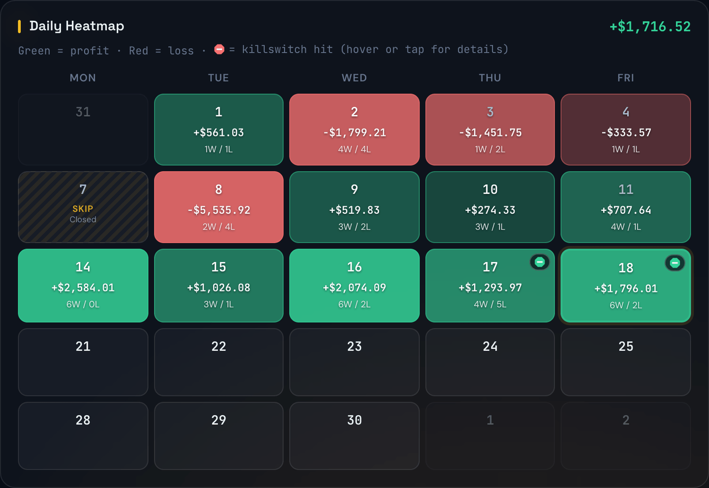
When a killswitch stops your trading, that day gets a small stop-sign marker in the top-right corner of its cell. It covers both kinds:
- Your account-wide Killswitch, which stops every strategy at once. The calendar calls this the Account killswitch and tags it Global · all strategies.
- A Per-Strategy Killswitch, which stops only that one strategy. The calendar shows it by the strategy's name.
The marker's color tells you which target fired:
- Red — a loss limit.
- Green — a profit target.
- Amber — both happened that day. For example, one strategy hit its profit target and another hit its loss limit.
- Blue — you stopped trading by hand that day and no target fired. See Stop Trading for Today.
If more than one killswitch fired that day, a number appears next to the marker.
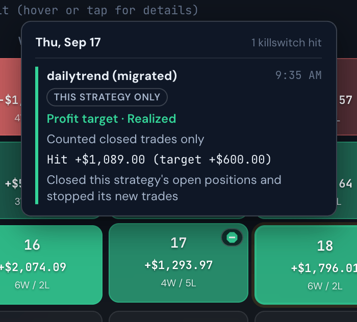
Hover over the day (or tap it on a phone or tablet) to see the details for each killswitch that fired:
- Which one — the account killswitch, or the strategy's name. A stop you made yourself reads You stopped trading.
- What fired — the profit target or the loss limit, or Stopped by you.
- Realized or unrealized — whether it counted only closed trades (Realized), or closed trades plus positions that were still open (Unrealized).
- The numbers — the profit or loss that tripped it, next to the target you had set.
- What the bot did — closed your open positions, or only stopped new trades and let open positions run on their own stops.
- When — the time it happened, on your device's clock.
Example
Tuesday's cell is red and shows a red marker with a 2. You hover over it and see:
- Account killswitch at 10:42 AM: Loss limit · Unrealized, Hit -$512.30 (limit -$500.00), Closed all open positions and stopped new trades.
- SPX 0DTE at 9:58 AM: Loss limit · Realized, Hit -$261.50 (limit -$250.00).
Now you know the whole account shut down at 10:42 AM because your open trades pushed you past your $500 limit, and that SPX 0DTE had already stopped itself earlier that morning.
In Year view, a month with any killswitch days shows the same marker, with the number of days. Hover over the month to list those days, then click the month to see each day's details. When the account has any recorded killswitches, the stats strip also shows Killswitch Days, the number of days in the month or year you're viewing on which one fired.
The markers follow the same Live / Paper and Strategy filters as the rest of the page. Pick one strategy and you'll see that strategy's killswitch days, plus any account killswitch days, because the account killswitch stops every strategy.
Note
Markers start from the day your bot began recording killswitches. Earlier days won't have a marker, even if a killswitch fired on them.
Tip
A row of green markers means you often reach your profit target early in the day. A row of red ones is a good reason to look at those days' trades, or to rethink the limit.
Navigating
Use the ◀ / ▶ arrows to move month to month, or year to year in Year view. Click Today to jump back to the current month or year.
The cumulative P&L line
Above the grid is a running line chart of your cumulative profit and loss. A steadily rising line is what you want. Choppy ups and downs that end up flat tell a different story than a smooth climb.
Use the 30D / 90D / YTD / All buttons on the chart to choose its time span: the last 30 days, the last 90 days, this year so far, or your whole history.
Filters
The Calendar reacts instantly to the filters above the grid:
- Source — show only automated trades, only manual ones, or both.
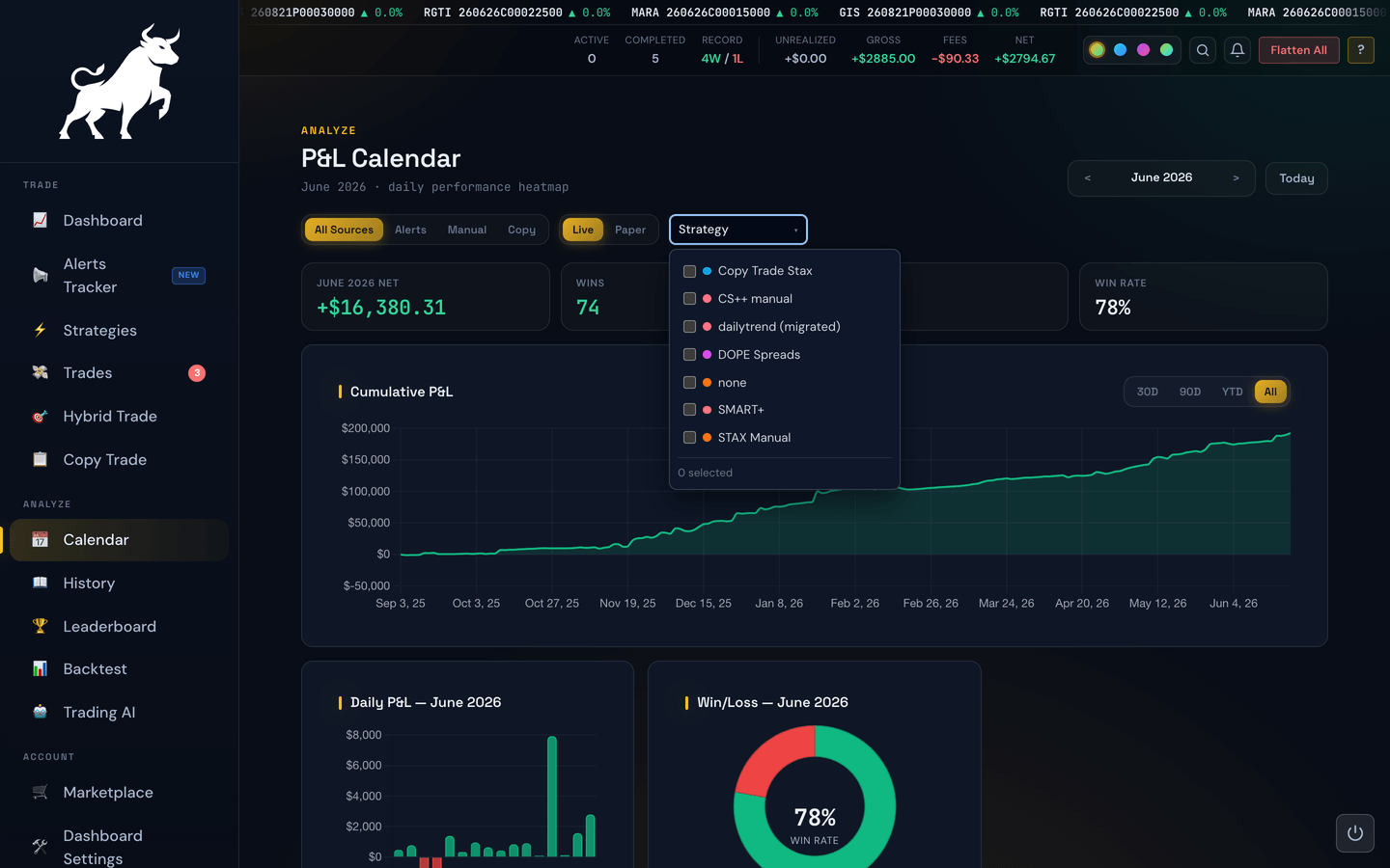
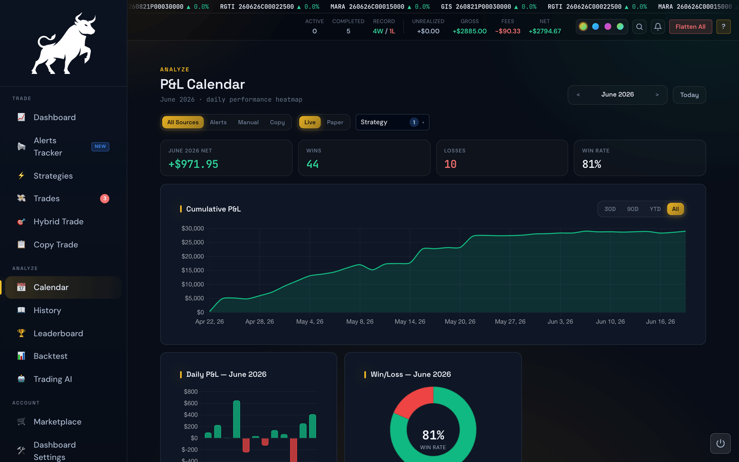
- Strategy — a multi-select dropdown that appears once you've traded more than one strategy. Tick one or more strategies and the calendar, the cumulative P&L line, and the month's charts all repaint to reflect just those strategies; leave it empty to include them all. Each strategy carries its own colored dot to match its pill elsewhere in the portal. The dropdown only lists strategies that have trades under the Source and Live/Paper filters you've set, so you'll never pick one that leaves the calendar empty — and if a filter change hides a strategy you'd ticked, it's dropped from your selection automatically.
- Live / Paper — when this is available on your account, switch between real-money and paper trades.
Example
You traded three strategies in May but want to see how one of them did on its own. Open the Strategy dropdown, tick just that one, and the calendar repaints — the green and red days now reflect only that strategy's results.
Digging into a bad day
The Calendar shows each day's total, not its individual trades. To see the trades behind a day, open Trade History and filter it to that date.
Example
You see one bright-red -$420 Tuesday in an otherwise green week. The cell has a red killswitch marker, and hovering over it shows your account loss limit fired at 11:05 AM. In Trade History, you find two stop-outs and one big loss on a put that morning. Now you know exactly what to learn from, not just that "Tuesday was bad."